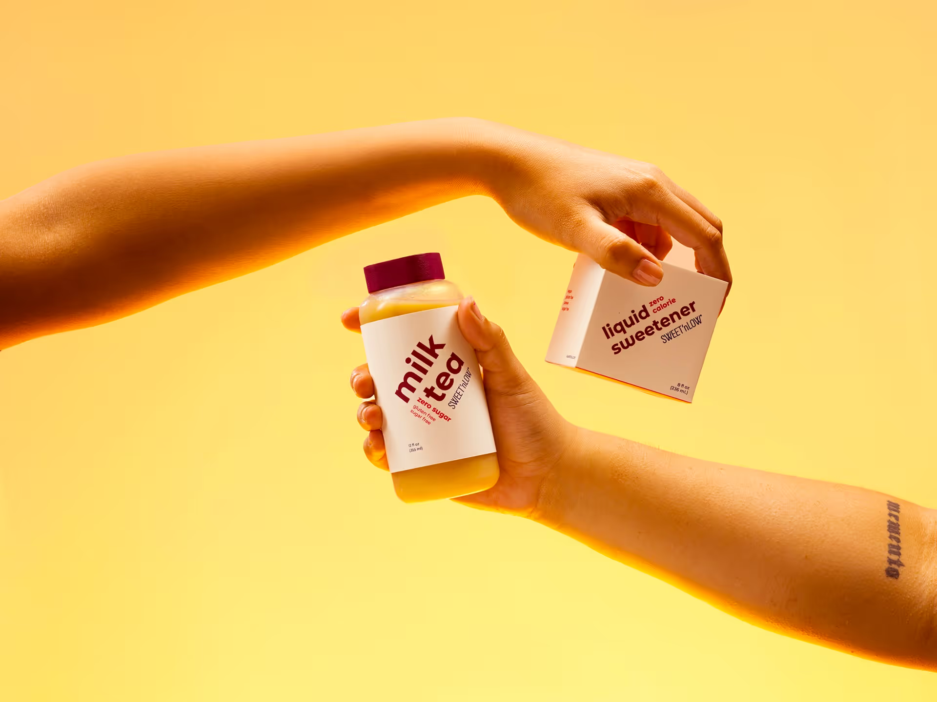
Sweet'N Low has a very playful, charming personality that resonated with me. The packaging system I developed became a study on form and how users interact with it to create an experience that goes beyond just visual aesthetics.
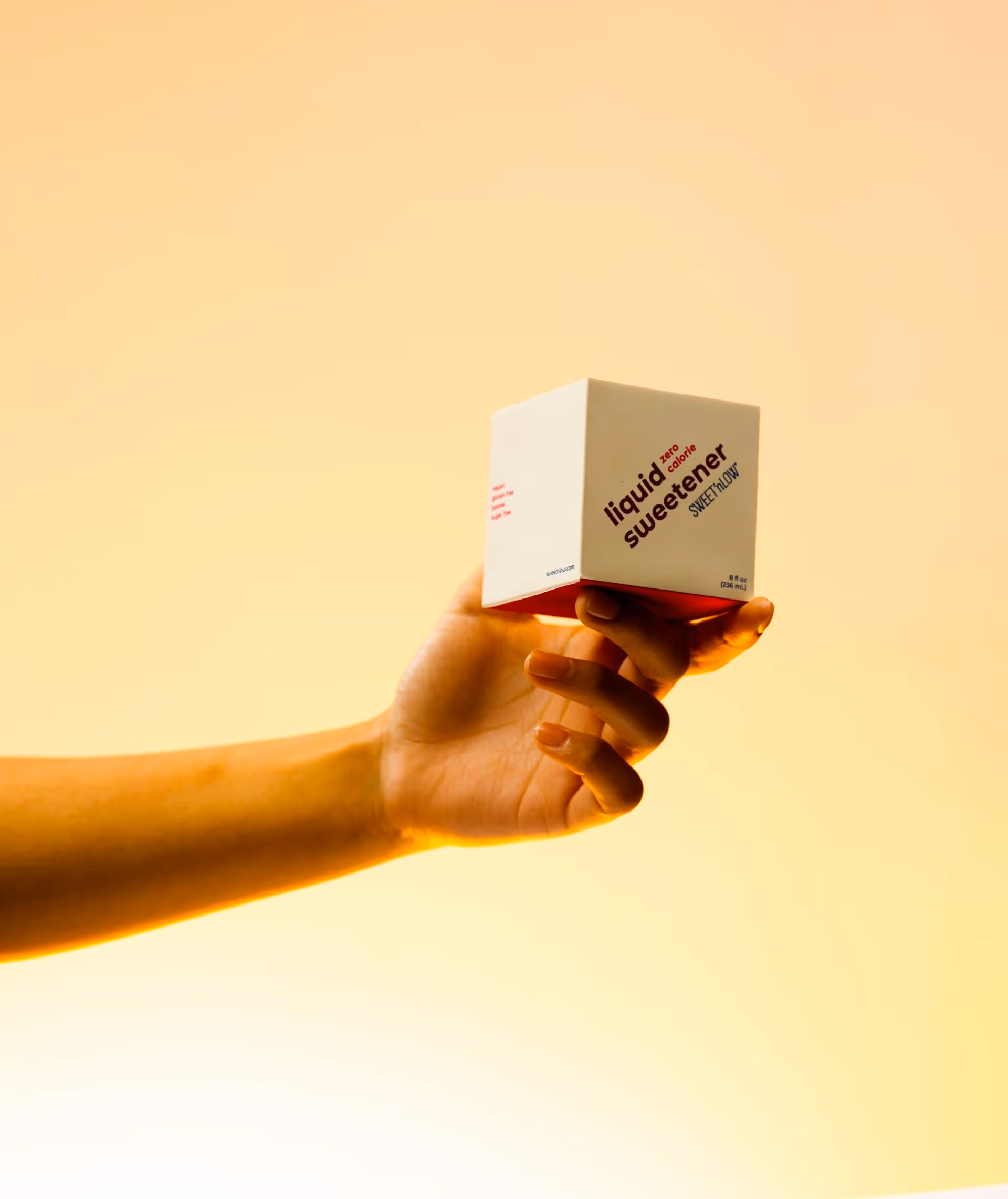
Sweet'N Low's rebrand moves it into a luxury space. I sought to modernize and adapt the packaging into something that would stand out amongst other brands through simplifying graphics and taking a typography-focused approach.
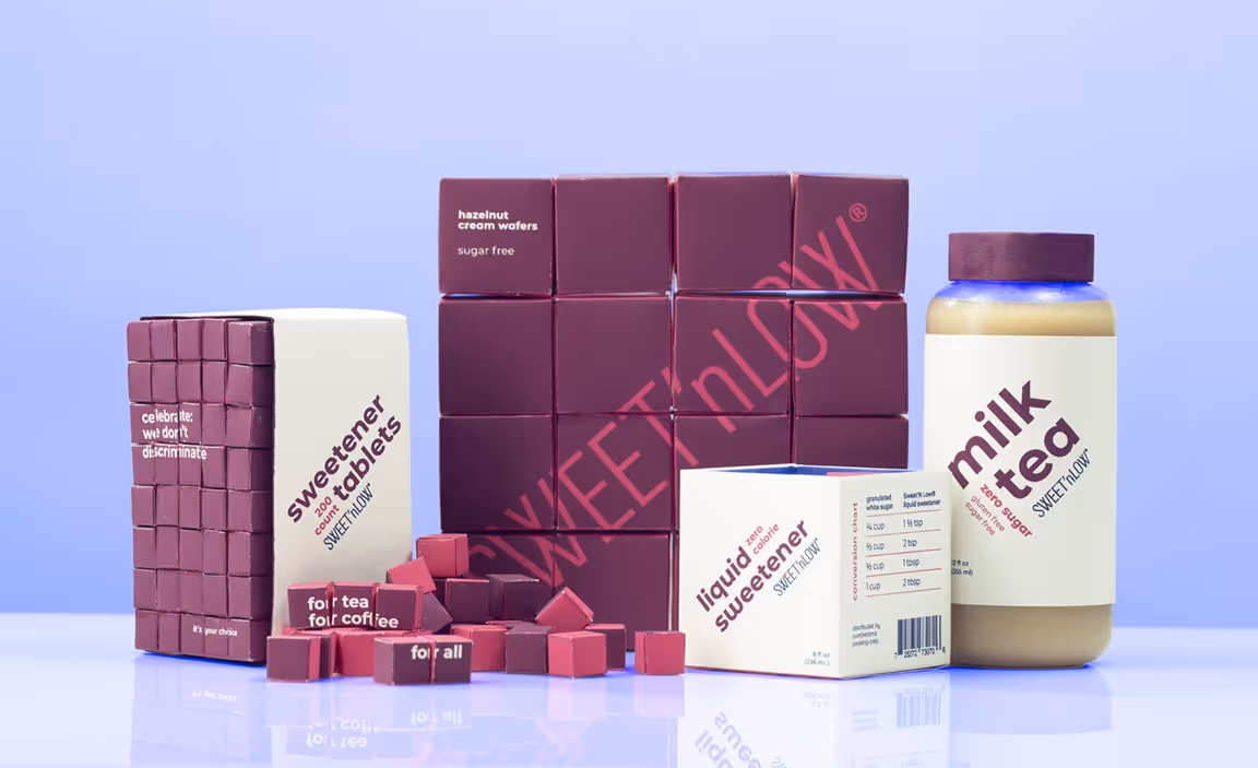
Dynamic design was integral to how I developed Sweet'N Low's packaging. Typography, form, and photography all combine to reflect the energetic, playful personality of the brand.

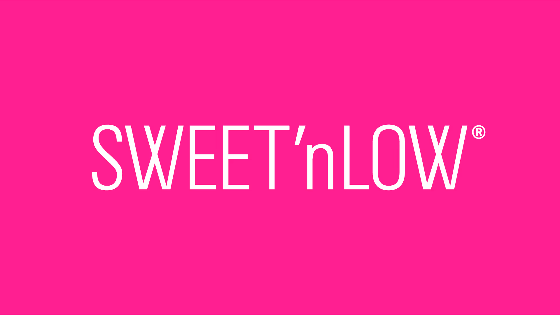
I modified Univers to represent intersectionality in Sweet'N Low by crossing the arms of the W.
In my research, I discovered that the audience for Sweet'N Low is primarily women, as it had heavy association with pink. I developed a gender-neutral palette that would appeal to people of all identities by using a deep purple and white for their primary colors.
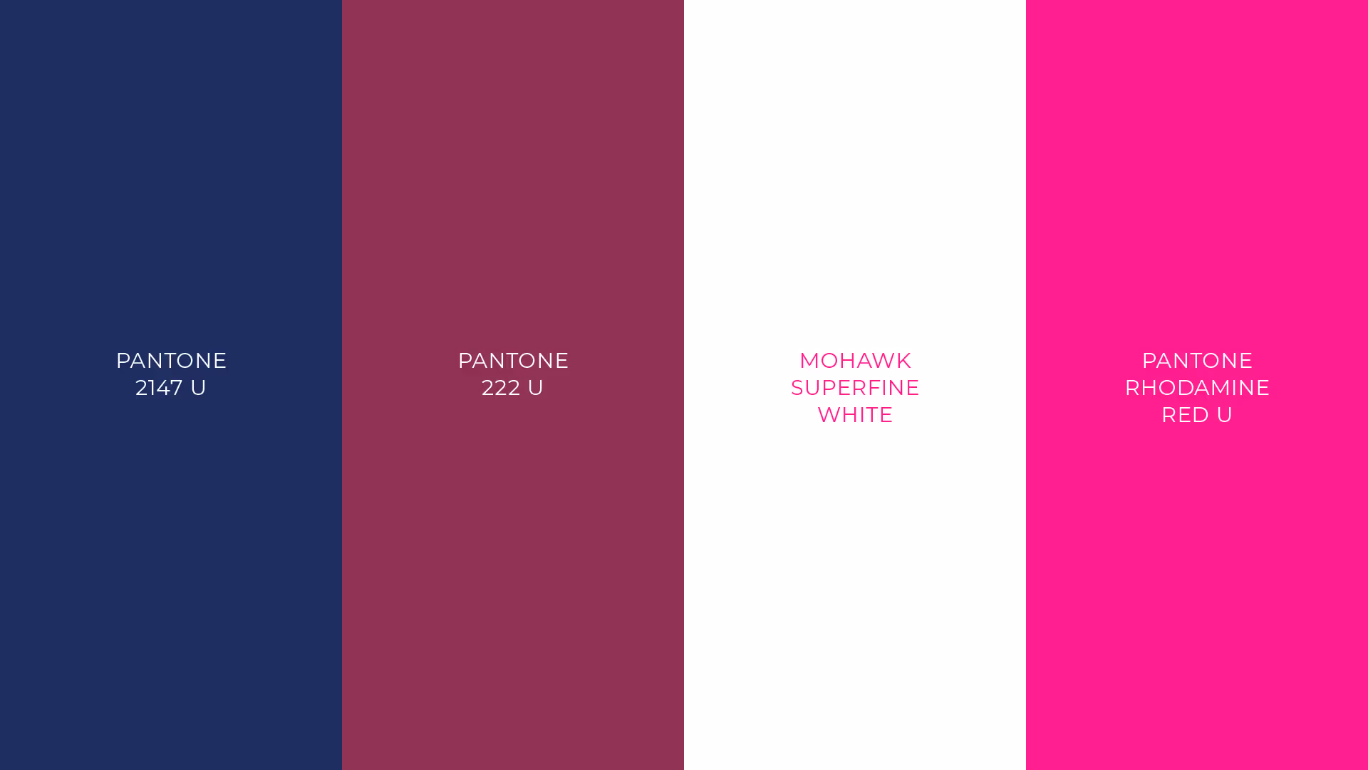
The introduction of new colors was also in response to my field research. I had discovered that the pink associated with Sweet'N Low has become appropriated for all types of saccharin, which made it difficult to stand out.
Food fosters community, and Sweet'N Low's community uses artificial sugars. This drove how I approached Sweet'N Low's identity: focusing on people and celebrating the differences in their dietary needs rather than being ashamed.
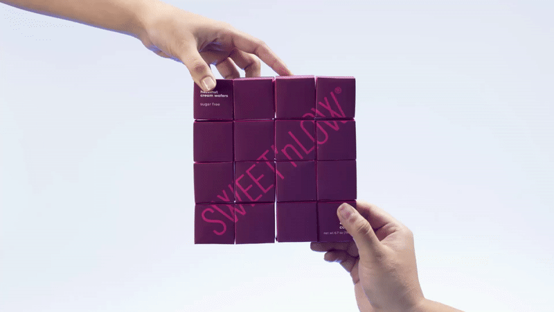
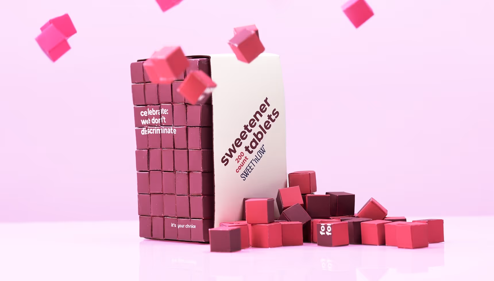
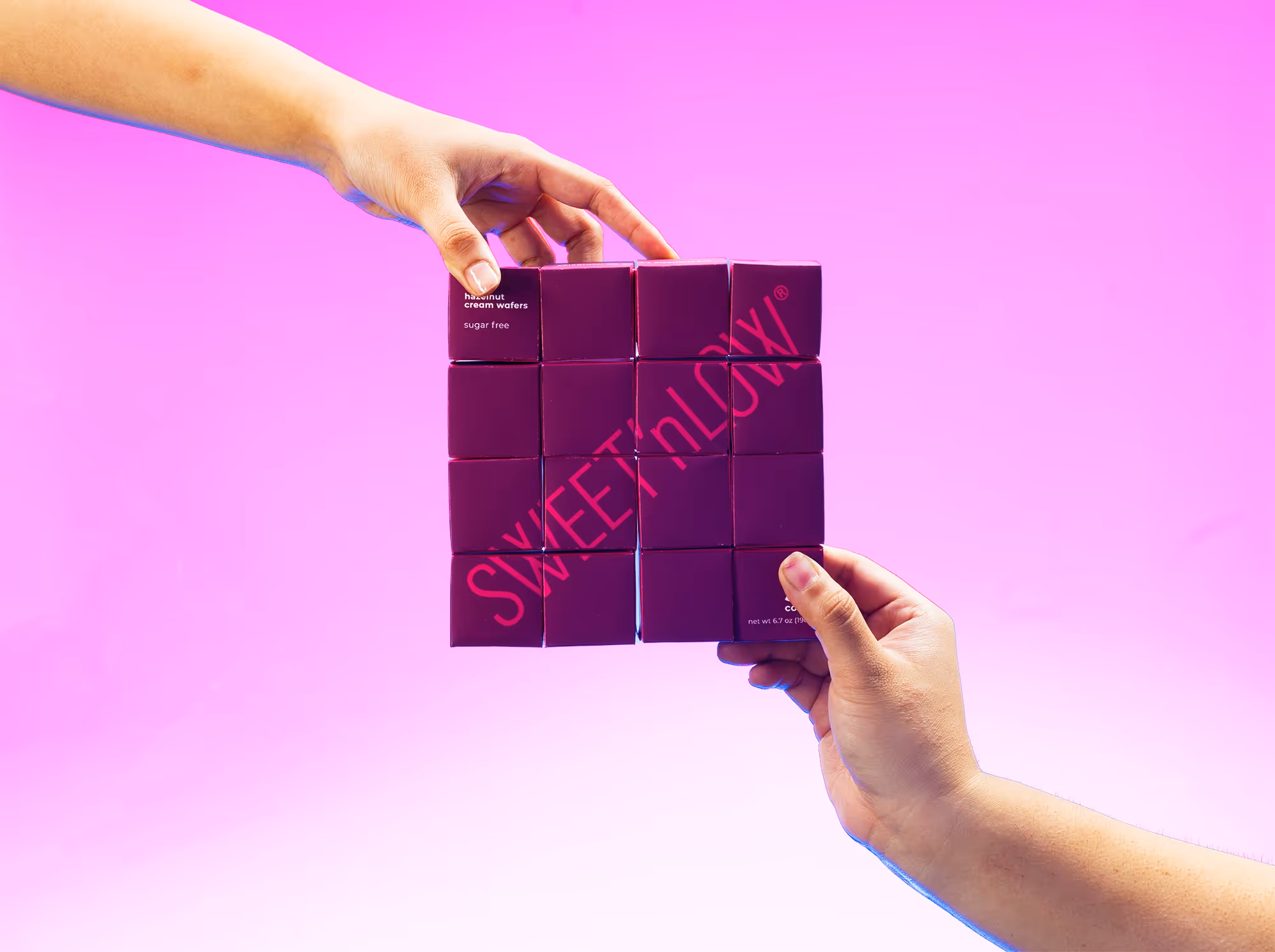
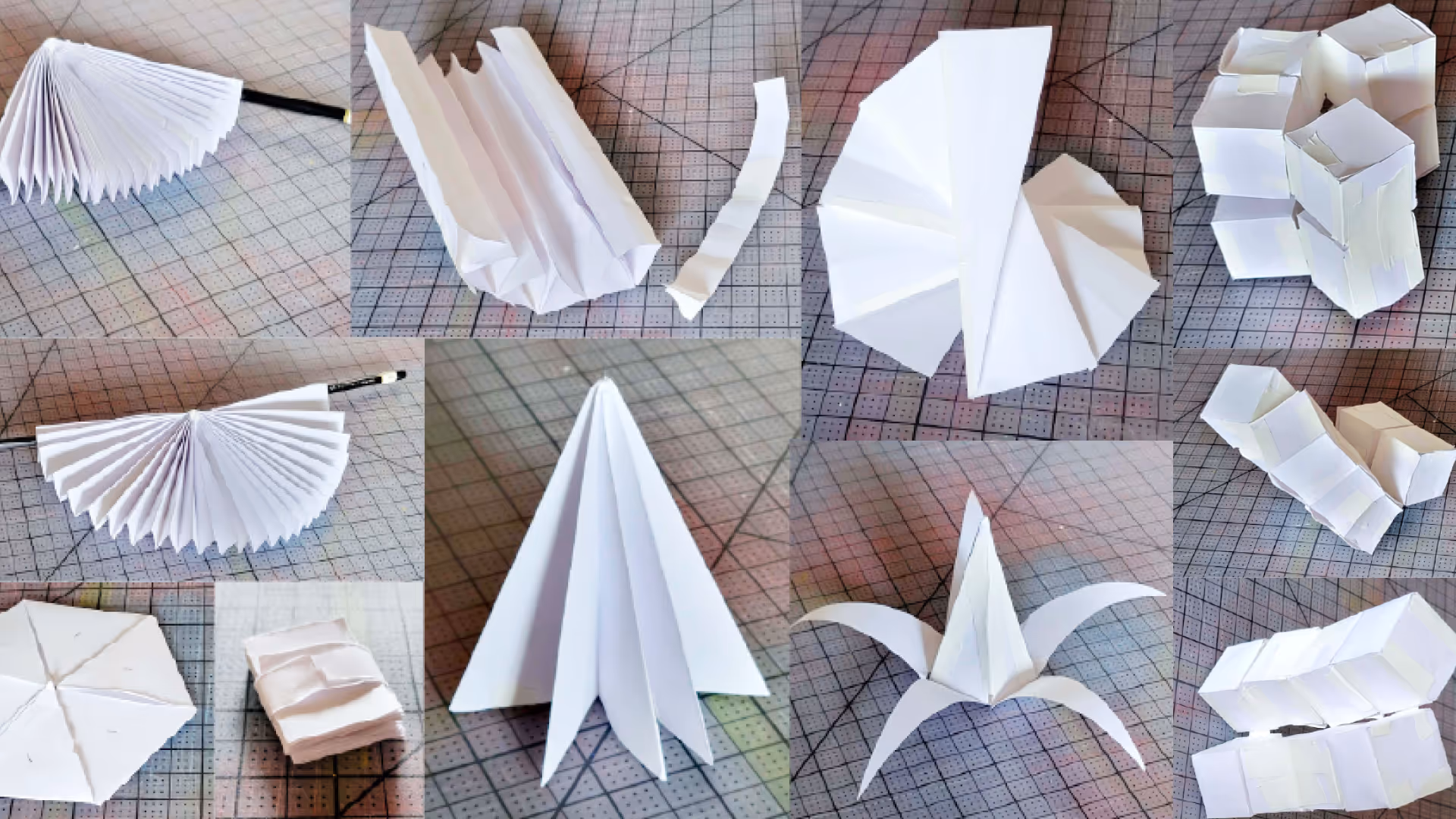
Transforming packaging and spots of color can be surprising. I aimed to create small moments of joy through hidden details.
The elements of surprise and play guided my form explorations. I looked into packaging that would transform depending on how the user interacted with it.
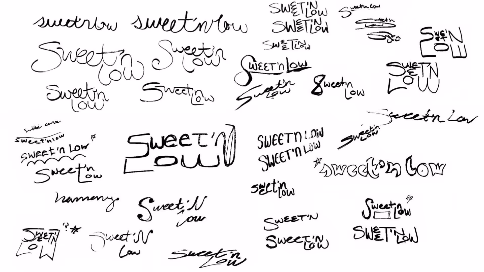
I explored a handwritten logo to create a playful, dynamic feeling. As I developed them further, I found that it lost the luxury component that I aimed to integrate with the packaging. I simplified the logo and put more emphasis on unity.
WITH SPECIAL THANKS TO
Ania Borysiewicz / Zack Gibson / Ashley Chavez / Saul Barrera / Sofia Avilez / Andreia Avilez
Do not repost or redistribute my work without explicit written permission from me.
I do not allow the use of my work for AI training.
