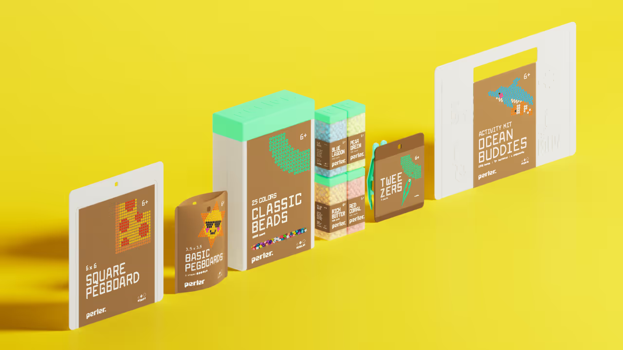
Perler is known for their fuse beads, which are small plastic beads that melt together when heat is applied. With the rise of plastic waste, I responded by designing a packaging system that would be their first step forward towards more sustainable practices. Perler is also growing more popular with teenagers and adults. The new packaging also expands Perler's audience to broader age demographic by balancing both playful imagery and colors with sophisticated typography.
When developing graphics, I wanted the labels to showcase artwork, such as the pizza. Not only does it create an eye-catching visual, but they can be recreated or used as a form of inspiration for future projects, which reinforces Perler's core of creativity and methodology.
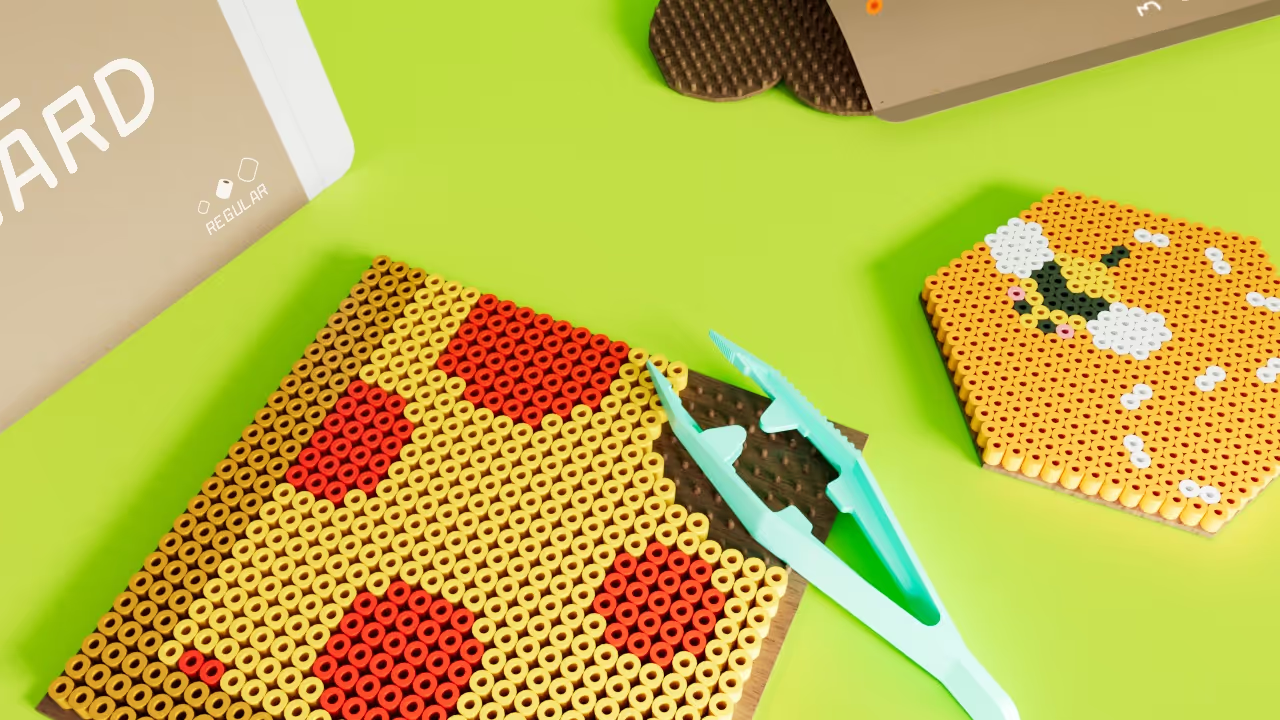

I didn't want to compromise fun just because the audience grew. Larabiefont was selected, as the typeface balanced personality and uniformity. This reflects the methodology of how Perler art is created: a uniform grid with boundless personality.
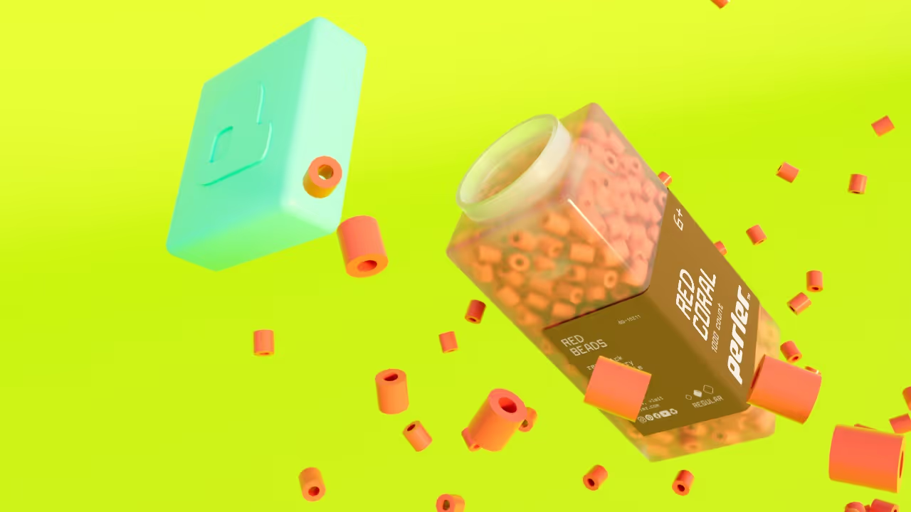
I was inspired by the shape of Perler beads for the new logo. When melted together, they create rounded squares. This shape language also applied to the packaging forms.
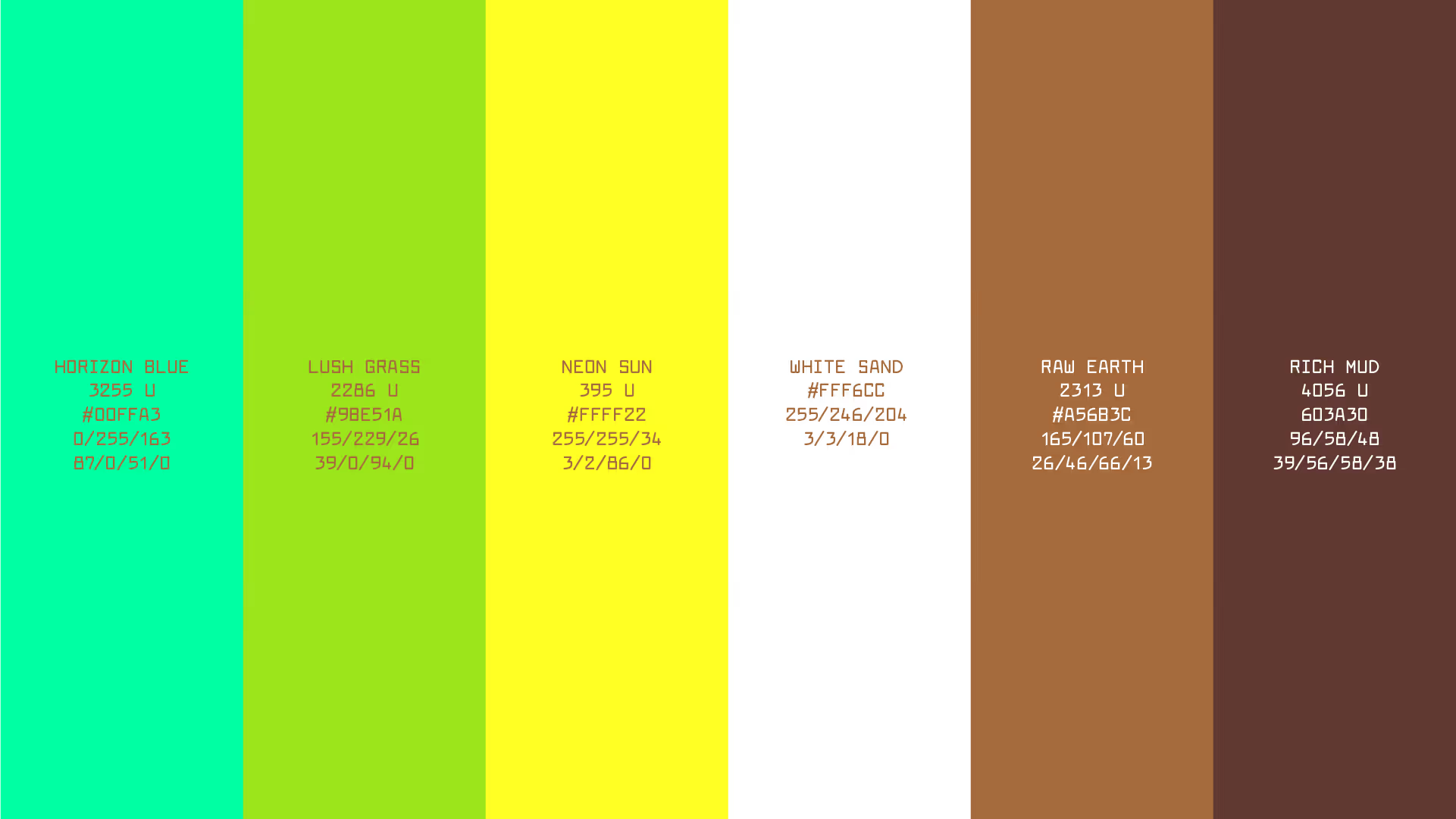
To reflect the broader age demographic, I chose to refine Perler's colors into a system by balancing playful colors with neutral tones.
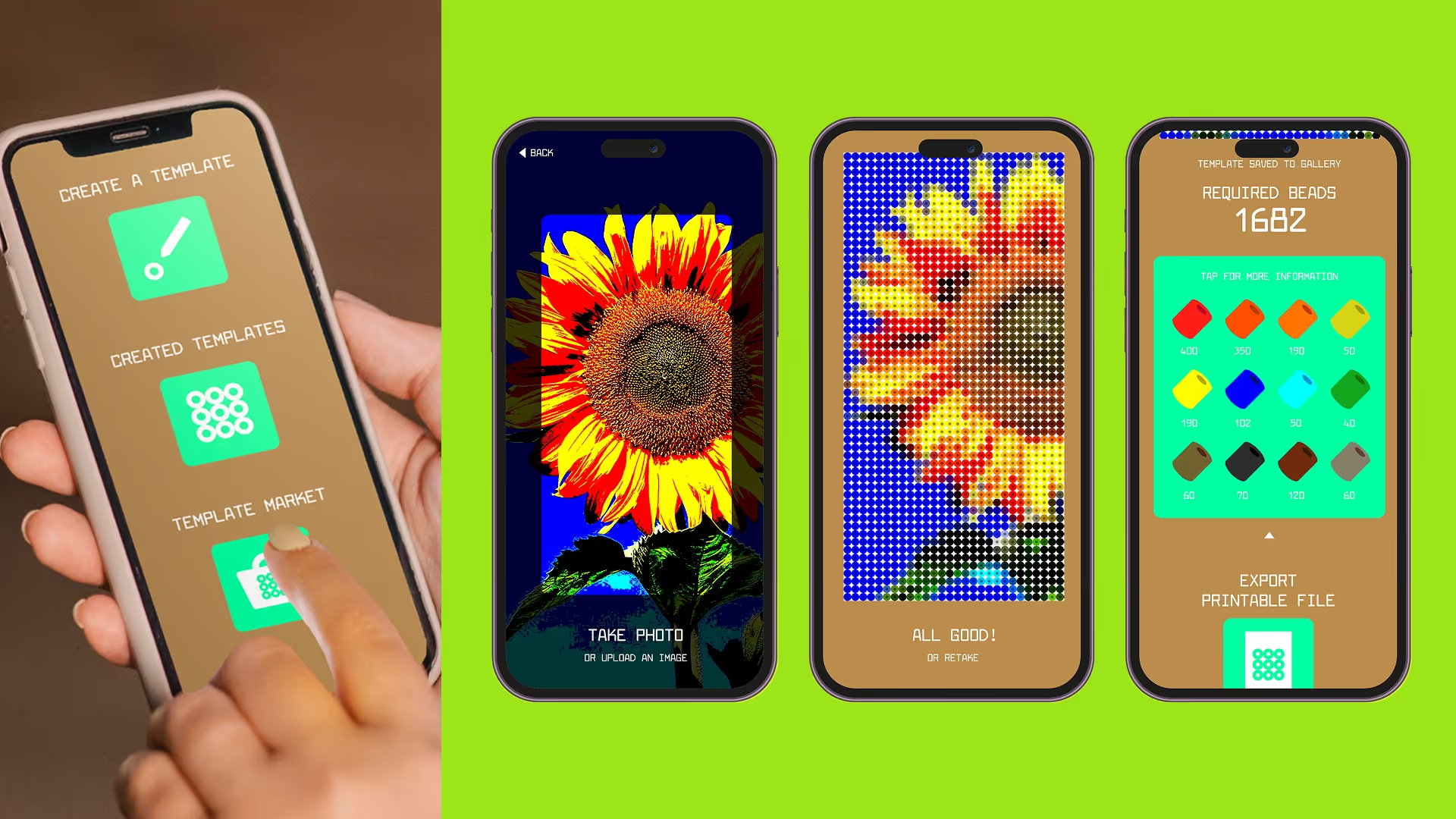
I believe creativity is communal, so I designed a mobile app that can make and share art templates with other Perler users worldwide.
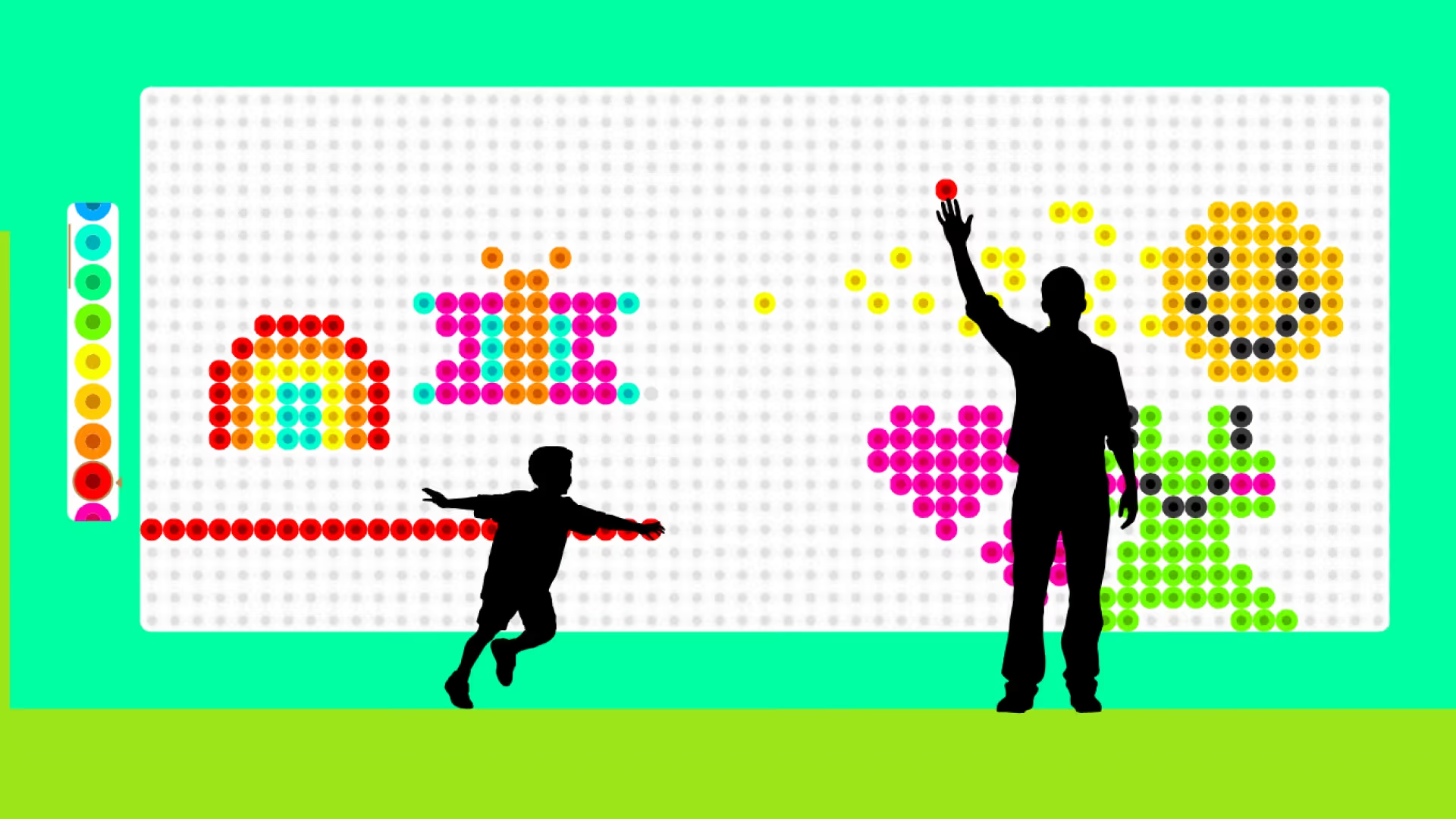
For pop-ups or other in-person events, I developed a digital canvas to unite Perler's community, where people can place one bead at a time to create a masterpiece together.
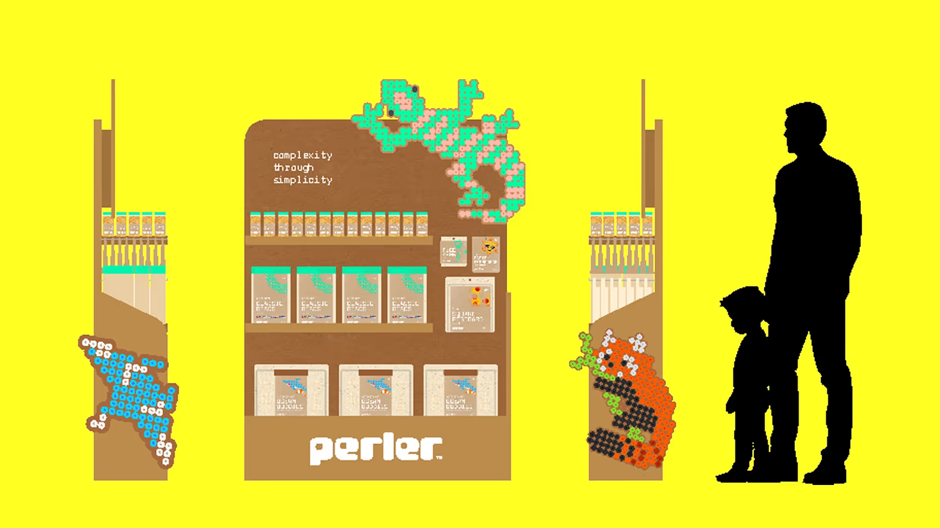
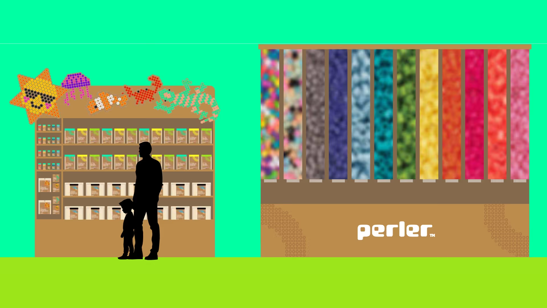
I considered various age demographics when designing Perler's standing display in department stores. Young children are likelier to want activity kits, so they are lower on the shelf. Items like individual colors and tools are shelved at a height where both teens and adults can reach, as their creative needs are more specific.
Perler doesn't have an in-person retail space. I put both convenience and sustainability in mind by providing buy-what-you-need stations for bulk refills for specific colors instead of buying new packaging.
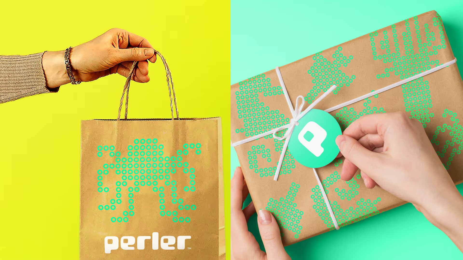
I want Perler's identity to be present in all aspects of their retail space. Utilizing their pattern system adds an element of joy and anticipation when receiving a gift wrapped in a particular design, like a sea animals kit.
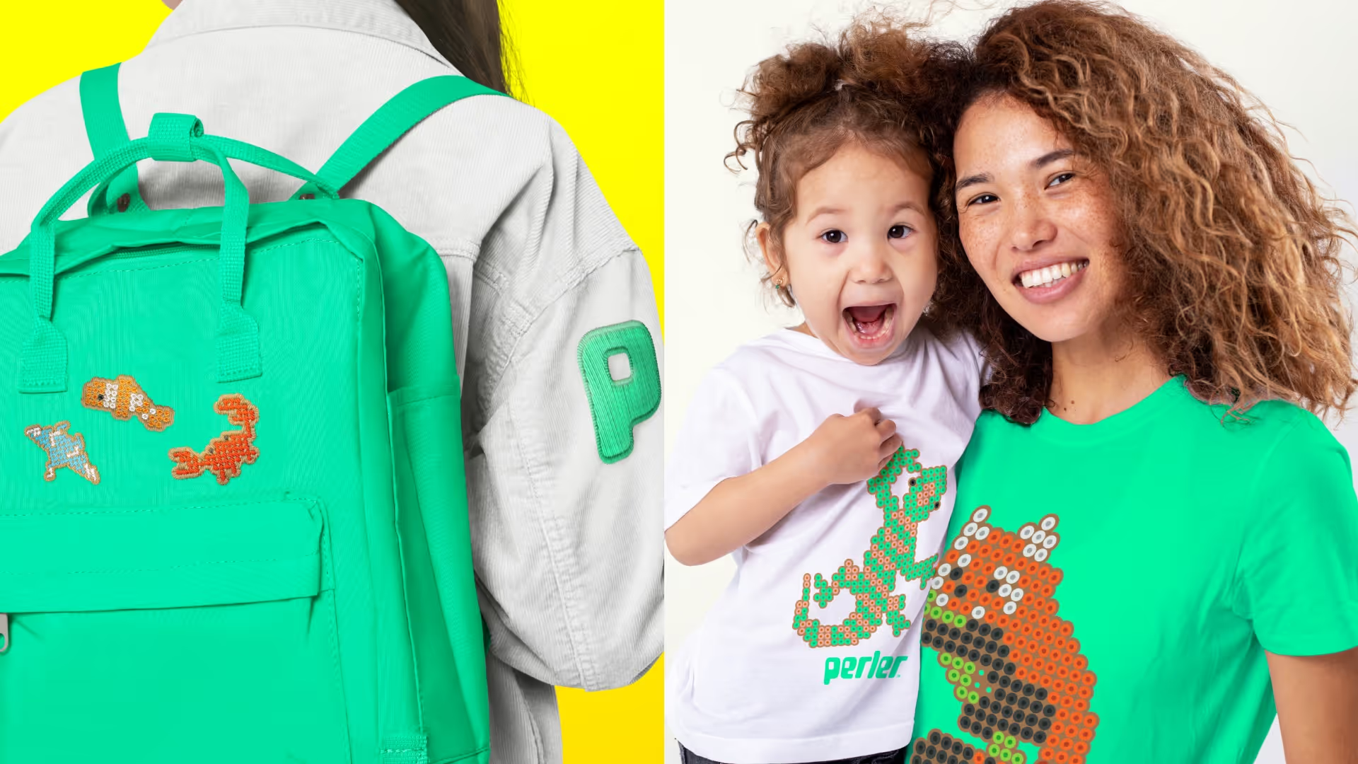
I considered how Perler could further their core belief of self-expression. A merch line could be established where Perler would sell shirts and badges that represent their specific activity kit designs.
In my sketching process, I explored secure and convenient packaging. As I made my own crafts with Perler, I realized that there was an issue with storage: bulk beads are difficult to return to their container, and individual trays were at risk of spilling everywhere (personal experience).
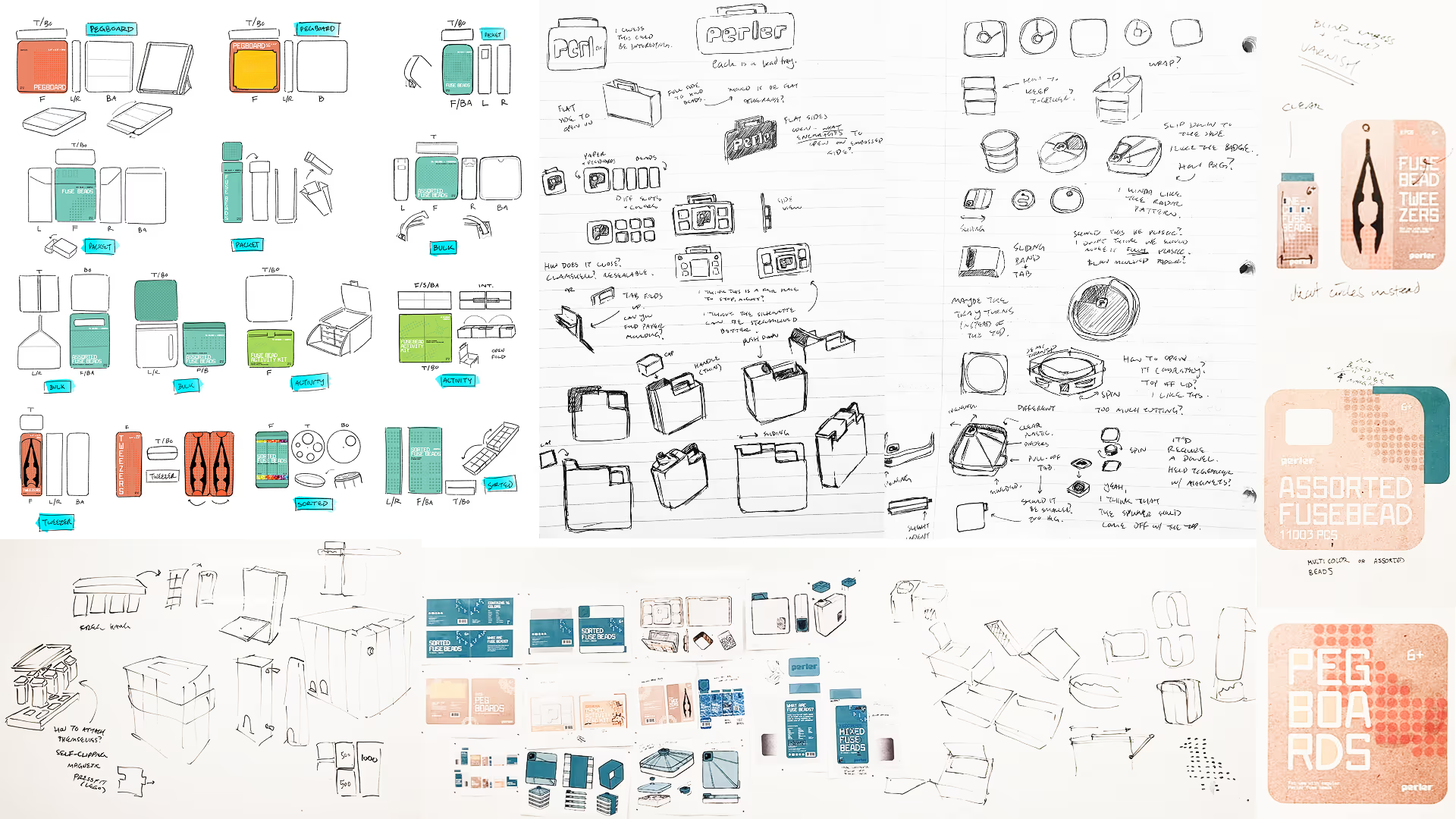
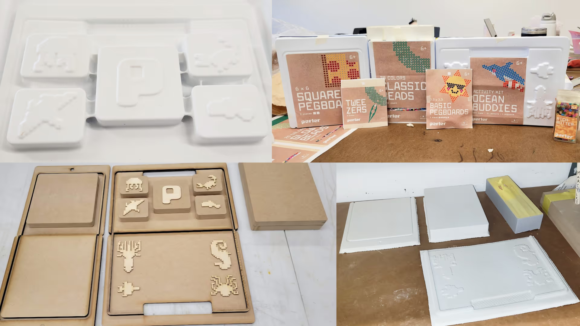
Across the packaging, I eliminated plastic by substituting it with moulded paper pulp. However, this came with another challenge: how would a consumer know what's inside the packaging if it's opaque? For the activity kit, I decided to embed silhouettes of possible designs. Similar to the labels, these shapes invite people in to stretch their creativity.
WITH SPECIAL THANKS TO
Paula Hansanugrum / ArtCenter model shop staff