Insurance is notoriously confusing, and its reputation for being cold is much to be considered. With Kaiser Permanente's refresh, I developed a new system that glows with warmth and emphasizes simplicity and care between their network and the people who need their services.

The Kaiser Permanente logo is inspired by Maslow’s hierarchy of needs, which is structured like a pyramid by order of priority. This layering element was taken and modified to create a sense of security and trust, with each layer wrapping around the core at the center. This gives Kaiser’s logo its namesake: core.
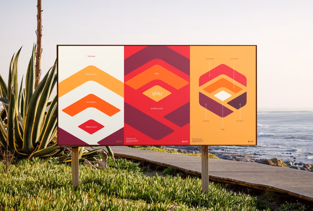
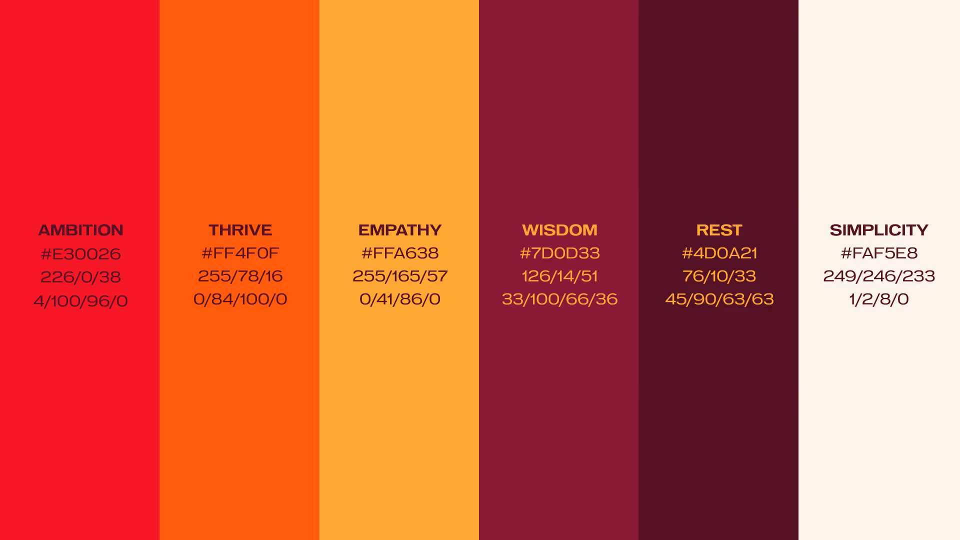
Taking cues from the sun, Kaiser Permanente’s colors inspire warmth and growth. Each color is named after how they encourage healthy living.
These posters were developed to highlight the individual experts that work for Kaiser Permanente and to emphasize the different steps to healthcare and thriving. Centering the doctors allows people to foster connections, not just feel like just another patient.
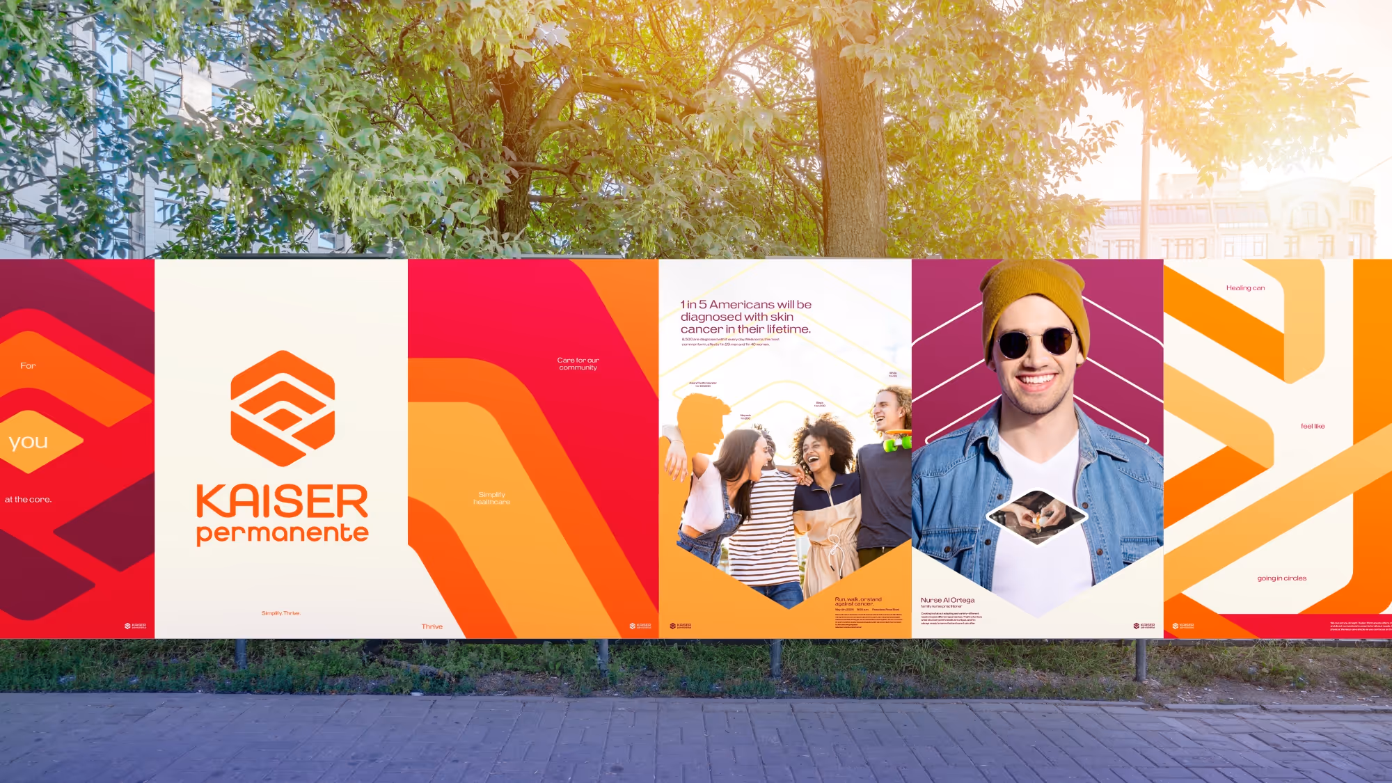
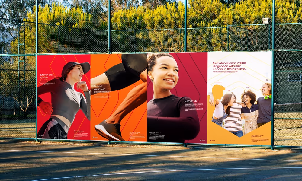
This poster series was made to promote a fundraiser event, as well as inform about cancer prevention. In context, the posters live in places where high UV exposure is common, such as outdoor sports.
Using the core as a framing device, Kaiser Permanente's social media presence is given a distinct appearance that is useful for vertical, square, and horizontal formats.

Working staff wear uniforms in the color of Wisdom, as the maroon tone is calming and comforting.

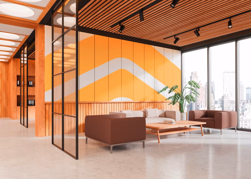
Hospitals tend to feel very sterile and miserable. Kaiser's refresh transforms the typical hospital space into a warm, comfortable environment for the long waits.
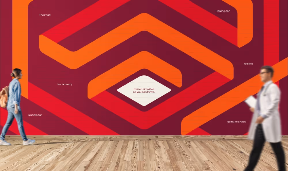
This wall mural represents the journey to recovery and acts as a beautiful set piece in the hospital space.
WITH SPECIAL THANKS TO
Elaine Lee
Do not repost or redistribute my work without explicit written permission from me.
I do not allow the use of my work for AI training.
